Product | Made Bank
Task | Design a Fintech App
Team Size | One
Role | Brand Designer, UX/UI Designer
Project Background | The fintech industry has rapidly evolved, reshaping financial management for individuals and businesses. This project seeks to create a user-centric iOS app in the fintech space, providing essential tools for users to take control of their financial lives. The goal is to design a Minimum Viable Product (MVP) that aligns with the dynamic fintech landscape.

A place to stock up
Invest in shares on the US and Australian markets, including ETFs, OTC securities, and fragmented shares.
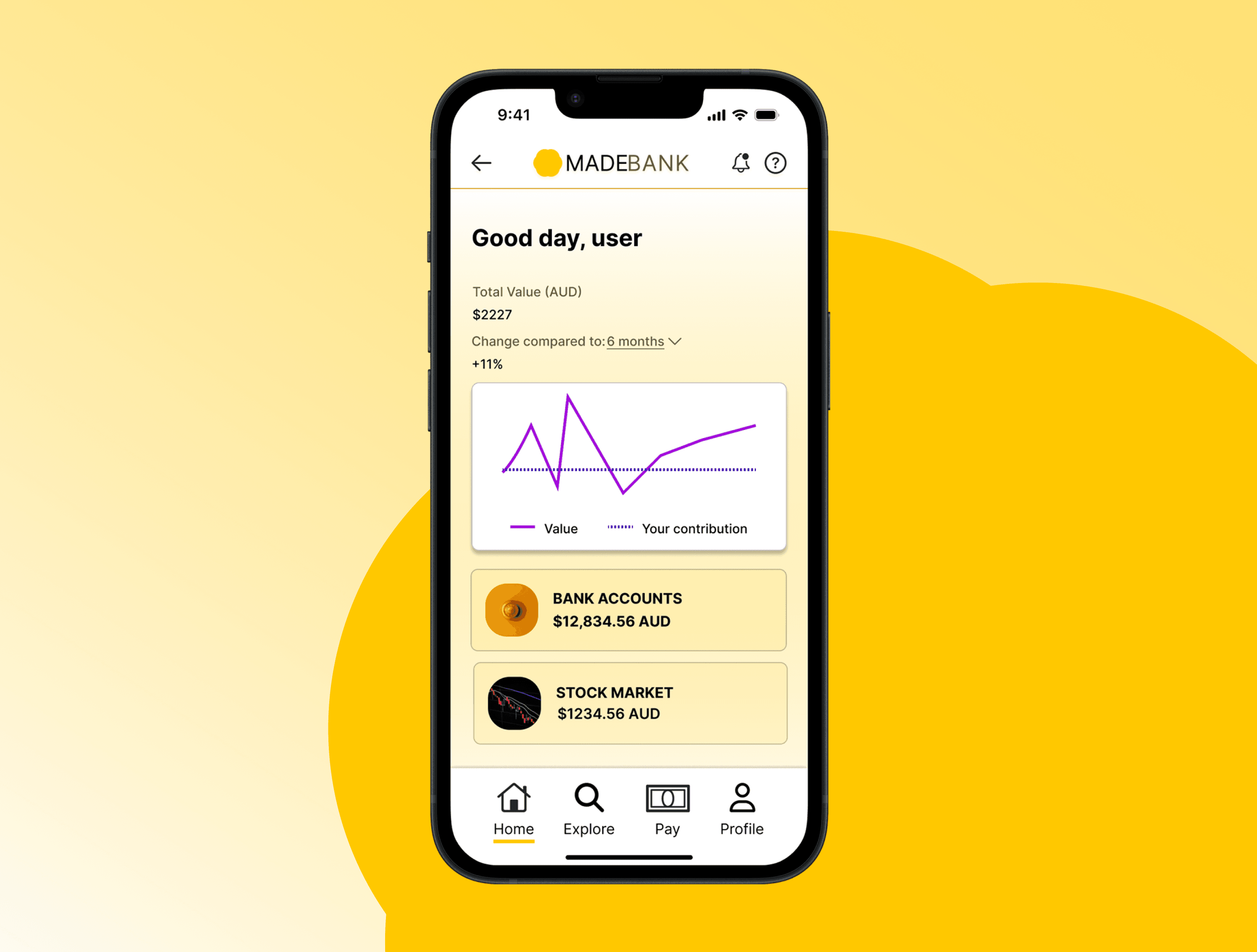
Save it or spend it
Create multiple saving and spending accounts. Save and earn interest, or spend using physical and digital debit card.
This app is Super
Keep an eye on your Super with MadeBank super fund, available in your dashboard and ready for quick top-ups.
Problem Statement
The financial technology market faces challenges such as fragmented services, unfamiliarity with new platforms, complex interfaces, limited financial education, and concerns about data security. These issues hinder users from efficiently managing their finances, making informed decisions, and achieving their financial goals.
Proposed Solution
Develop a user-centric fintech app that acts as a one-stop platform for financial empowerment. This app will address challenges by unifying financial services, providing an intuitive and secure platform, offering personalised insights, facilitating investment opportunities. The solution aims to empower users to take control of their financial lives, make informed decisions, and confidently build their financial futures. The app can be customised for implementation by banking institutions, addressing issues of unfamiliarity and fragmentation in the financial technology landscape.
User interview summary
Participants: 5
Pain Points : Users are encountering various pain points either whilst using fintech apps, or avoiding apps as a result of frustrations and preconceptions.
From the user interviews, there were consistent themes between users.
Users are:
Overwhelmed by choice - with an abundance of apps vying for attention, users often do not know where to start, causing some to avoid trying out unknown apps from unknown companies.
Underwhelmed by function - users are frustrated by seemingly 'single purpose' apps, and feel each task seems to have its own app.
Lacking in trust - prevalence of new, faceless apps from unknown companies causes hesitancy amongst users.
Bored - users are not finding their current experiences exciting or engaging.
Competitor analysis

Competitor analysis was carried out focusing on the offerings of investment platforms as well as local banking apps, investigating differences and commonalities. Several financial platforms were evaluated based on key features described as important to users. The consolidated solution suggests developing a fintech app that combines these strengths while addressing weaknesses, offering a comprehensive, user-centric financial empowerment platform.
How might we?
Streamline mobile based financial workflows for users in an engaging, exciting yet familiar way?
Flows
User and task flows were built to establish core patterns, and to provide structural visualisation to help wireframe these flows.
Core flows
log in to dashboard
purchase new shares in a company
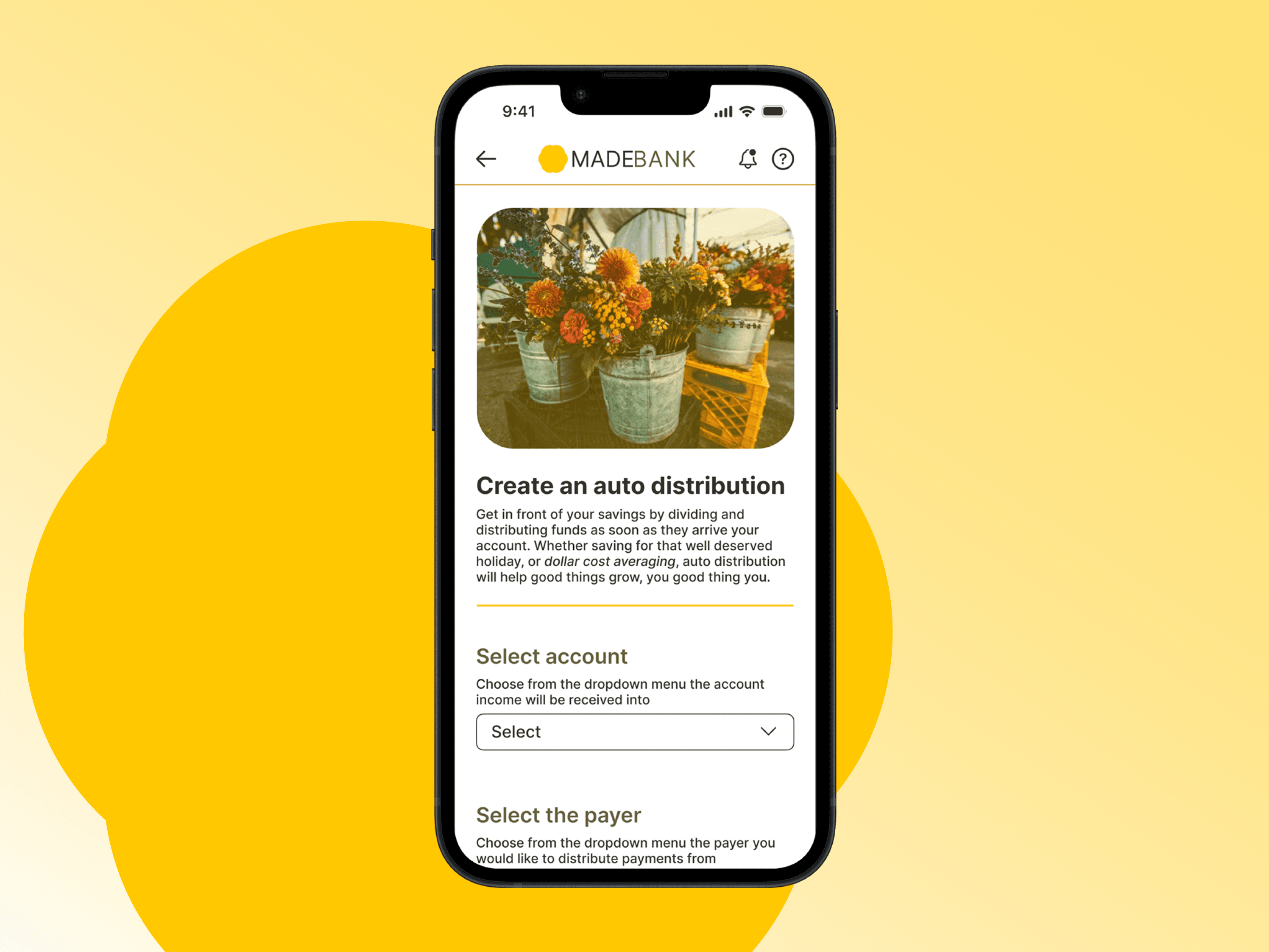
create auto distribution
The flows aim to use familiar patterns. Clear task flows empower users by providing them with a sense of control and understanding of their financial actions. This is particularly important in fintech, where users make critical decisions related to their money. Well-designed task flows contribute to a sense of empowerment and trust in the app. In an app such as this, where users value speed and accuracy, optimising task flows can make a significant difference.

Brand

Branding: designed for versatility, and minimal. App may be used as a skin, customising the app with a completely different brand. Use of colour, text, and placement of logos is considered throughout with this in mind.
Colour: Monochromatic yellow symbolic of growth, prosperity, gold.
Logo: Inspired by flower, simulating growth, and gold bullion, the logo is a minimal shape - multifaceted, simple, malleable.
Typography: Sans serif font for clarity. A common typeface - Inter is clear and clinical, which suits an app like this. App may be used as a skin, with font replaced, so this could be placeholder.
Wireframes


Sketching examples for key screens of 'purchase shares in a new company' flow.

Example frames building out portfolio, stock, and account dashboards.
Usability test results

Revisions
Key revisions have been made to improve the user experience, based on the prototype testing carried out.
Improved copy
Increased space between sections
Added stock prices - stocks in list are to be added from Stock Market section
Added terms and conditions linking and agreement checkbox
Improved prompting
Adjusted test alignment
Added imagery
Added micro interactions
Adjusted scroll positioning and dropdown behaviours
Prototype
Final prototype of Auto Distribution Wizard
Final Results & Reflection
Working on an app in the fintech space highlighted the use of market research, testing, and an awareness of market factors. I worked on a fintech app as it is an exciting field, with many newcomers looking to disrupt the industry. As the research showed however, users want improvements and change, however that is somewhat conflicted by the need for familiarity. Key takeaways are to test early and often, keep an open mind as to where a feature might end up, and as always, you are not your user.